
Here's what i came up with so far....
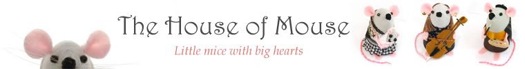
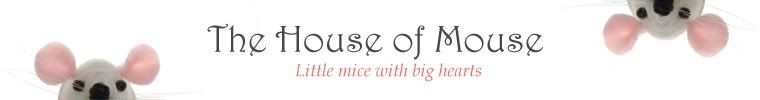
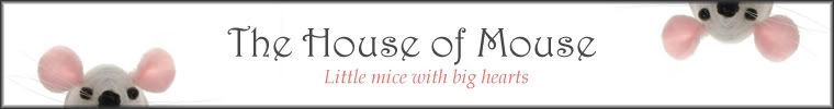
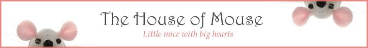
I added a border because the banner will be white on white and I wondered if it looks better with a border for the mouse to be peeking over. Of course I could do the first one with a border too... I'm undecided... what do you think?


I think I like the thrid one best they are all good really. I just love your shop sooo cute :) Great job with he treasury to its gorgeous!
ReplyDeleteBoy you pose a difficult question there. Number one of course shows more of what you do but the ones with the mouse peeking over are very good too. Thinking carefully I think I like the one without border and the mice peeking over. A border cuts them off in some way I can not precisely define.
ReplyDeleteSo peeking mice without borders is my choice.
I like the fourth one the best.
ReplyDeleteI'm for 1st or third :)
ReplyDeleteI like them all but the third one is my fav!
ReplyDeleteI like the fourth one best, with the pink border. I love the little mouse peeking down from the top! My second choice is the third one.....
ReplyDelete#1 or #2 ......
ReplyDeleteI saw the one with the pink outline as your Etsy banner and really liked it as it matches the mouses ear. I've now looked and you have no border so your banner is a little lost in the background as it all just blends in. I'm sure you'll find the right one though
ReplyDeleteBy the way have you thought of using one of your mice banners for your blog?
ReplyDeleteYou can get a plain white background in the templates and under house of mouse you could have smaller writing underneath saying 'life, craftiness and everything else... (I think its like that on my blog... not sure though will have to go and check :P)